


Translating your fintech app’s strings into Slovak is the easy 10%. The other 90% is context: which screen the text sits on, what the user is afraid of at that moment, which financial term a Slovak customer actually recognises, and which EU rule the sentence must satisfy. At glocco® we handle fintech localisation for EU product teams, and this is the routine we would hand to a friend about to ship a Slovak version.
Why translation alone fails in fintech
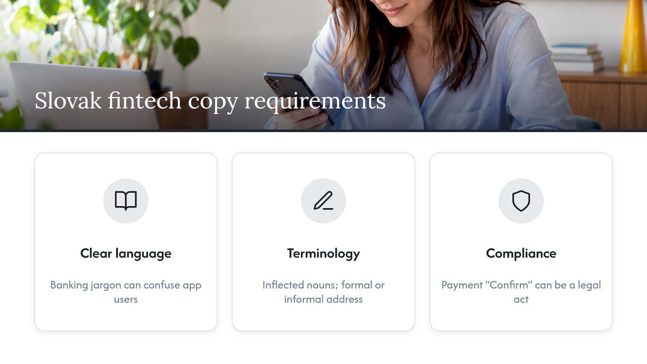
A button reading “Confirm” is harmless in a to-do app. In a payment flow it is a legal act. Slovak adds its own wrinkles: inflected nouns, formal and informal address, and text that often runs longer than English.
Financial UI localisation covers information hierarchy, locale conventions, layouts and jurisdiction-specific requirements, not just words. Fintech users also meet jargon early. UX testing of banking apps found that institutions often use specialist vocabulary users do not understand. If your English source is already dense, a literal Slovak version will be denser still.
So the job is three things at once: clear language, correct terminology and compliant wording. Miss one and users stall, support tickets pile up or compliance sends the build back.
Start with Slovak users, not strings
You cannot localise everything first. Pick the journeys where wording decides whether the user continues.
Slovak research gives a hint about priorities. Young users aged 18 to 25 lose trust when a digital channel sends them to a branch for something they expect to finish on a phone. For that group, trust is as much about smooth, fast digital service as about security features. Copy that leaves a user stuck in a flow is a trust problem, not a style problem.
A practical order for a first release:
- Registration and onboarding
- Identity verification (KYC)
- Payment confirmation and failure messages
- Fees, limits and contract terms
- Security alerts and authentication prompts
- Support and complaint entry points
The Finax study by ui42 shows how this is found: in-depth interviews and moderated usability testing surfaced barriers such as complex registration and product misunderstanding.
What to give the localisation team
Send a spreadsheet of strings and you will get a spreadsheet of Slovak strings. Send context and you get usable copy. A good brief includes:
- the screen or flow, ideally a screenshot or prototype link
- the outcome the user wants and the state they are in (nervous, rushed, locked out)
- tone guidance, including formal or informal address
- character limits for buttons, banners and push notifications
- a glossary of approved terms
Product teams that localise well pass on screen and flow context, the desired outcome, tone and character counts, then check the text in the real UI for overflow, odd line breaks and special-character problems. Slovak diacritics (č, š, ž, ľ, ĺ, ŕ, ô) break more fonts and exports than people expect. Check them on a real device, not in a design file.
Terminology: decide once, use everywhere
One concept, one Slovak term. If “limit” is sometimes a limit, sometimes a cap and sometimes a ceiling in English, decide what the Slovak customer will see and stick with it across the app, emails, legal pages and support scripts.
Build a short style guide with:
- approved terms for core concepts (account, transfer, standing order, instant payment, authorisation)
- tone and address rules (vykanie is the safe default for money)
- patterns for errors, confirmations and empty states
- rules for plurals and inflection, so “3 transakcie” and “5 transakcií” are handled by the code and not by luck
That last point is a developer issue as much as a language one. Hard-coded plural strings are the most common reason Slovak UI looks sloppy.
Onboarding and KYC: where copy earns its keep
Remote onboarding is where unclear text costs real money. EBA guidelines on remote customer onboarding, applicable from 2 October 2023, expect information to be current and adequate, captures to be readable and of high quality, and identification to stop after technical deficiencies or an unexpected connection interruption. Each of those becomes a screen with words on it: “photo too dark”, “connection lost, start again”, “why we need your document”.
Explaining pays off. In Slovakia, 365.bank saw video-call verification use fall from 25% to below 10% after adding a screen that explained biometric verification. One screen of plain Slovak, a big shift in behaviour.
Payments, fees and security messages
Payment copy has to be exact and calm. Three areas to get right:
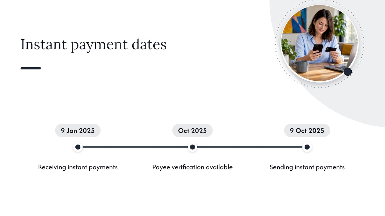
Instant payments. In euro-area countries, providers had to offer receiving instant payments by 9 January 2025 and sending by 9 October 2025, and Verification of Payee became available to customers from October 2025, according to the National Bank of Slovakia. Payee-check results (match, close match, no match) are brand new UX copy in many apps, and users will read them literally.
Fees and contract terms. EBA consumer guidance tells users to review the full tariff, processing and supplementary charges, total cost, contract duration and withdrawal conditions. Your copy should make each of those findable and unambiguous in Slovak.
Security. The same guidance asks users to report suspicious activity or unauthorised access promptly and to protect their security data. Alerts that say what happened, what the user should do now and where to report it beat generic “something went wrong” every time.
For the payment-specific screens, our guides on payment gateway localisation and PSD2 screen localisation go deeper.
Compliance and accessibility sit in the copy too
Slovak law cares about how consumer information is presented. The Payment Services Act requires that consumer rights information is easily accessible on the provider’s website, with equivalent formats for persons with disabilities. In practice that means legal text, help centre and in-app notices need the same care as the main flow, and compliance should see the Slovak wording before launch, not the English source alone.
Review and testing before launch
Linguistic review is step one. Step two is watching real Slovak users. Treat each key sentence as a hypothesis.
What to run:
- Think-aloud tests. Ask users to predict the next step and explain terms in their own words.
- Small samples. Specialists at ui42 and UXtweak note that around five representative respondents often reveal most critical interface issues.
- Slovak-first tasks. In a study for VÚB, UXtweak translated and rephrased the instructions into Slovak for young participants, so the test itself did not confuse them.
When people misunderstand a screen, the fix may be a flow change rather than a better sentence. Feed that back to design and product, not just to the language team.
Who does what
Localisation fails when it belongs to nobody. A workable split:
| Role | Owns |
|---|---|
| UX writer | Source copy, intent, tone |
| Localisation partner | Slovak wording, glossary, in-context review |
| Designer | Layout, text expansion, fonts |
| Developer | Plurals, formats, string handling |
| Compliance | Legal wording, mandatory disclosures |
UX writers need to understand the product context and design flow, and gather stakeholder feedback and proofread before go-live. Put the glossary where all five roles can see it.
Our perspective
Fintech copy is a small amount of text carrying a lot of weight. A user decides in a couple of seconds whether a screen deserves their money.
That is why we do not treat Slovak as a conversion of English. We localise with the screen in view, with the glossary agreed and with compliance-sensitive wording handled by people who know the sector. It is the approach behind our fintech localisation work for EU product teams: modern technology and proven localisation practice working side by side.
Our advice? Bring us in before the strings are frozen, not after the first support ticket!
glocco®
Where glocco® fits
glocco® has provided translation and localisation since 2014 across 76 languages, with specialised workflows for fintech and other compliance-sensitive sectors. If you are planning a Slovak release, start with our fintech localisation guide, or look at HumanPro for text that needs expert human attention. Want to see how we would handle your flows? Tell us what you are shipping.
FAQ
Is machine translation enough for fintech UX copy?
It is a fine first draft for volume, but onboarding, payment, fee and security text carries legal and trust weight. Those strings deserve human review in context, with an agreed glossary behind them.
Should Slovak fintech copy use formal or informal address?
Formal address (vykanie) is the safe default for anything involving money, identity or contracts. A friendlier register can work in marketing or gamified features, if your brand voice guide says so and the choice is consistent.
What should we localise first?
Start with registration, identity verification and payment confirmation, then fees and security alerts. These are the points where a misunderstanding stops the user or creates risk.
How long should Slovak strings be?
Plan for them to run longer than English and give the localisation team character limits per element. Then check overflow, line breaks and diacritics on real devices before release.
Sources
- Designing financial UI for 15+ countries
- 13 UX zistení pre bankové aplikácie, ui42
- Banky riskujú stratu mladých, Startitup
- Finax case study, ui42
- How we localise UX copies at Gojek
- EBA guidelines on remote customer onboarding (SK)
- How 365.bank improved online onboarding
- SEPA Instant Credit Transfer, Národná banka Slovenska
- EBA factsheet for consumers (SK)
- Payment Services Act, Národná banka Slovenska
- 6 foolproof steps for user testing microcopy
- Case study: feedback for VÚB, UXtweak


